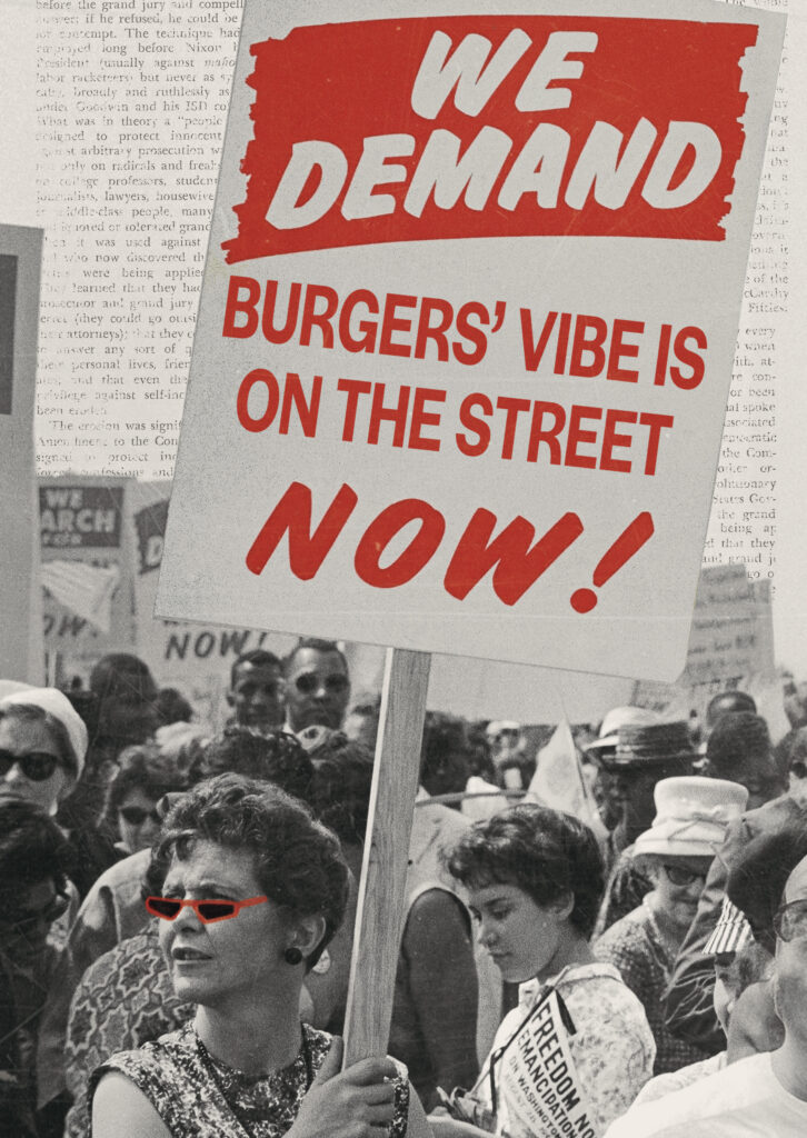
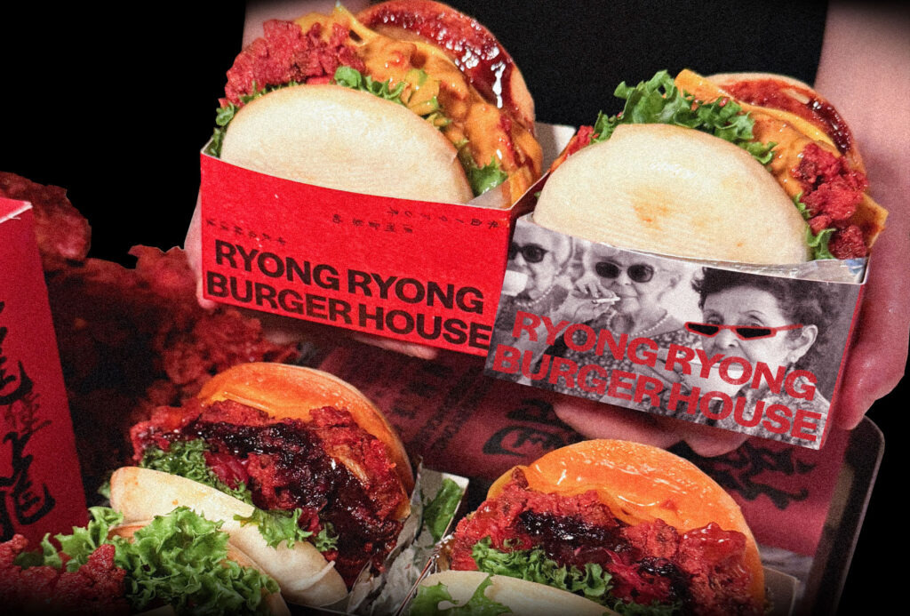
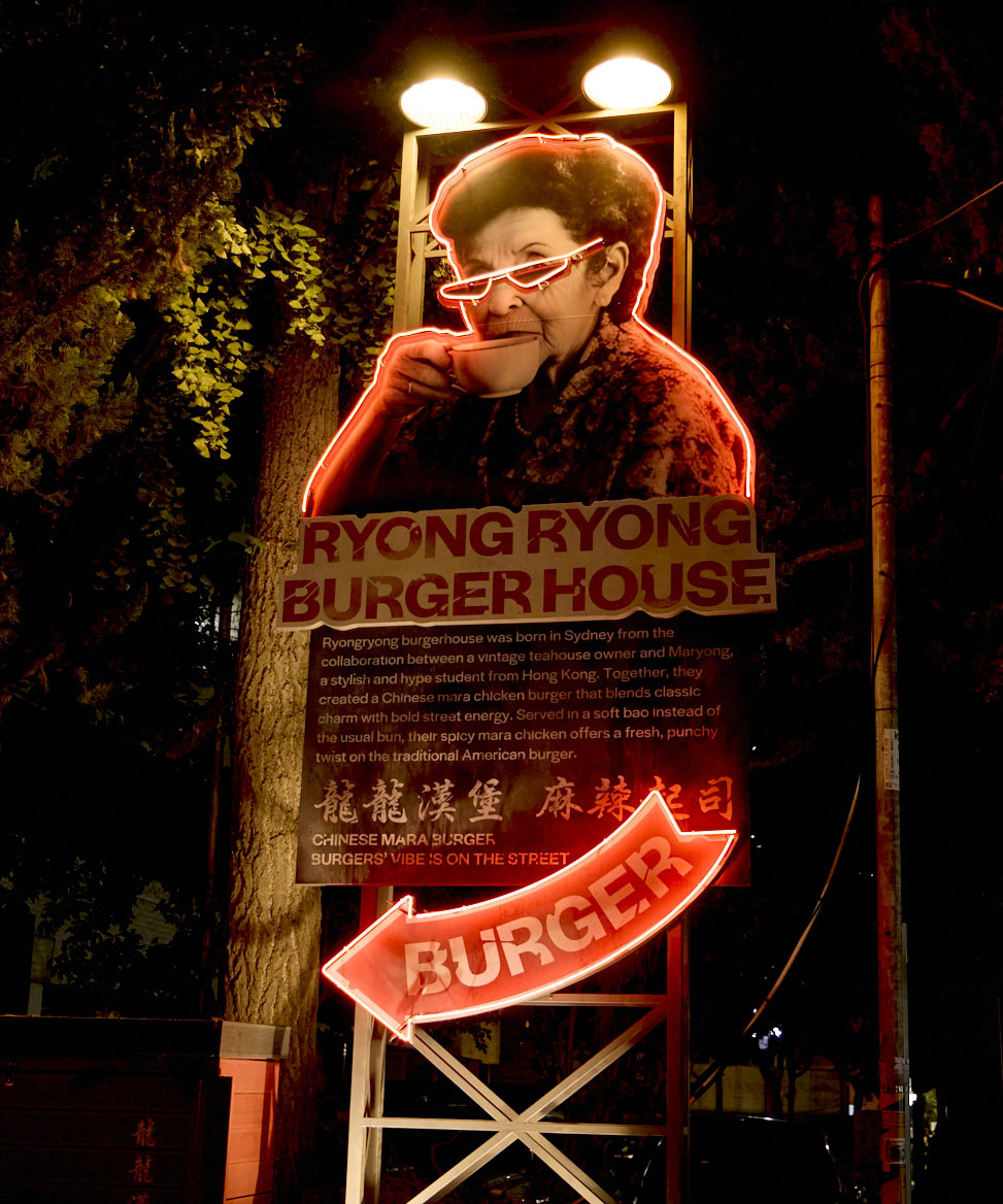
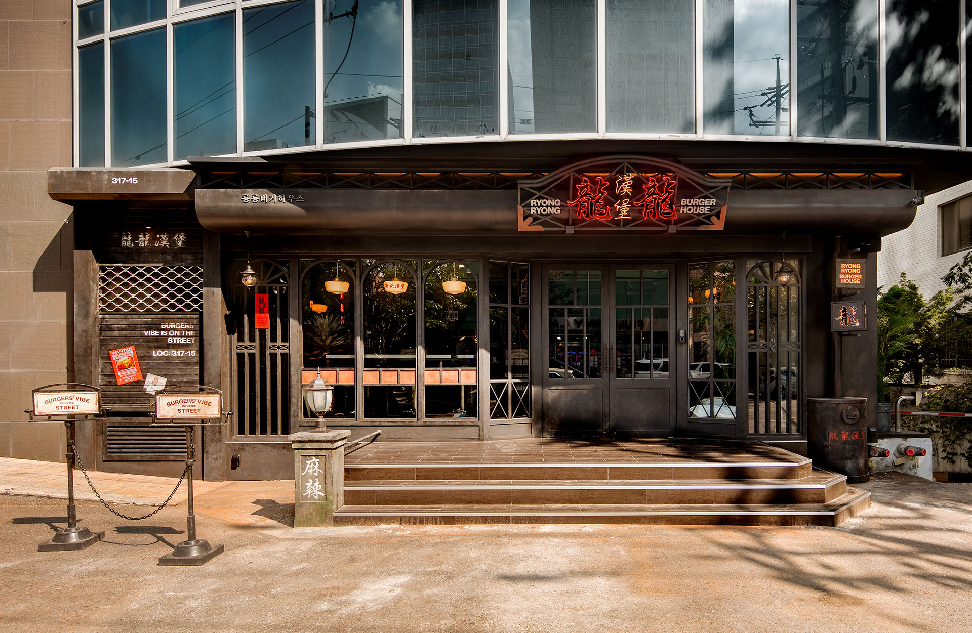
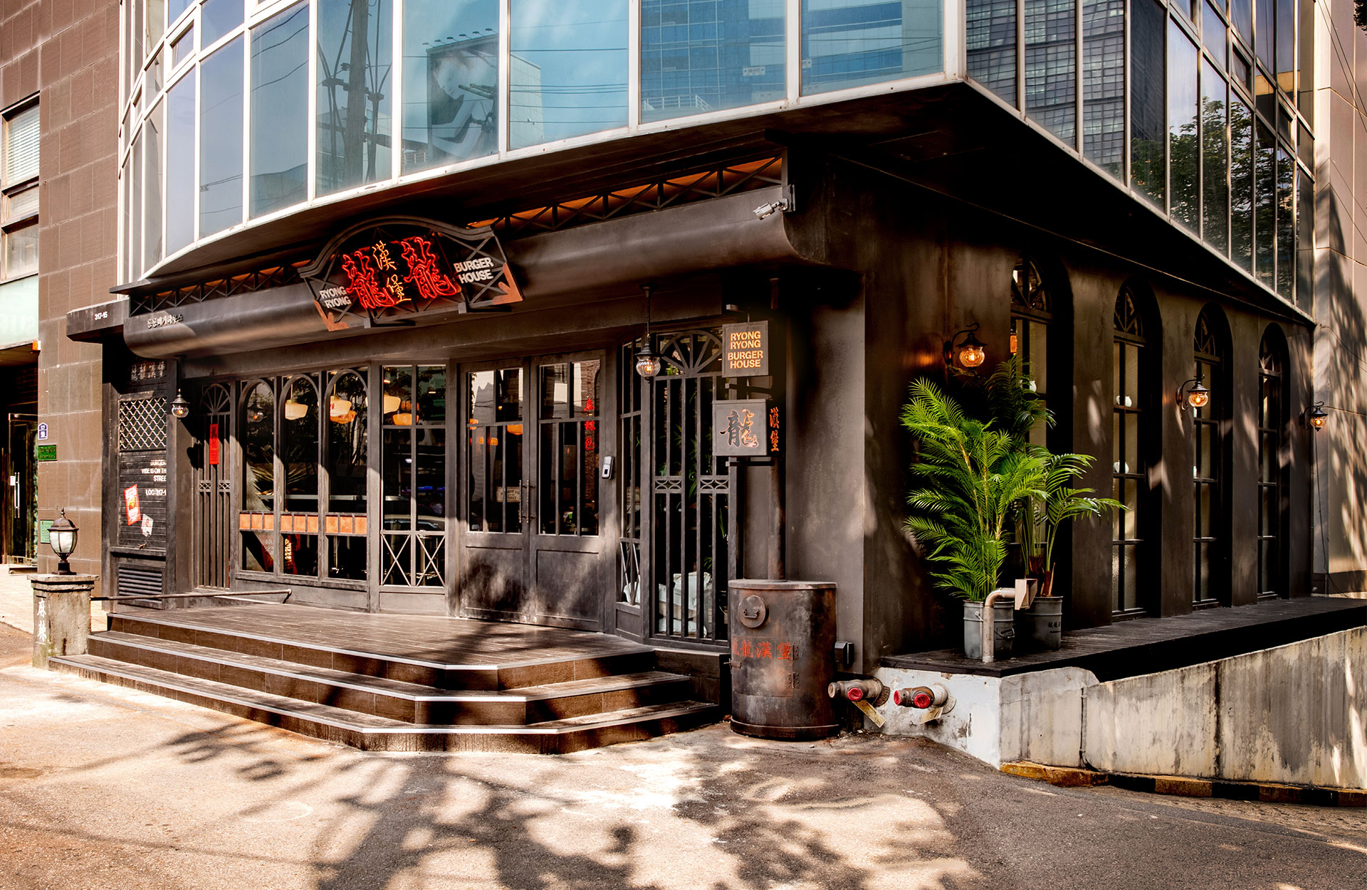
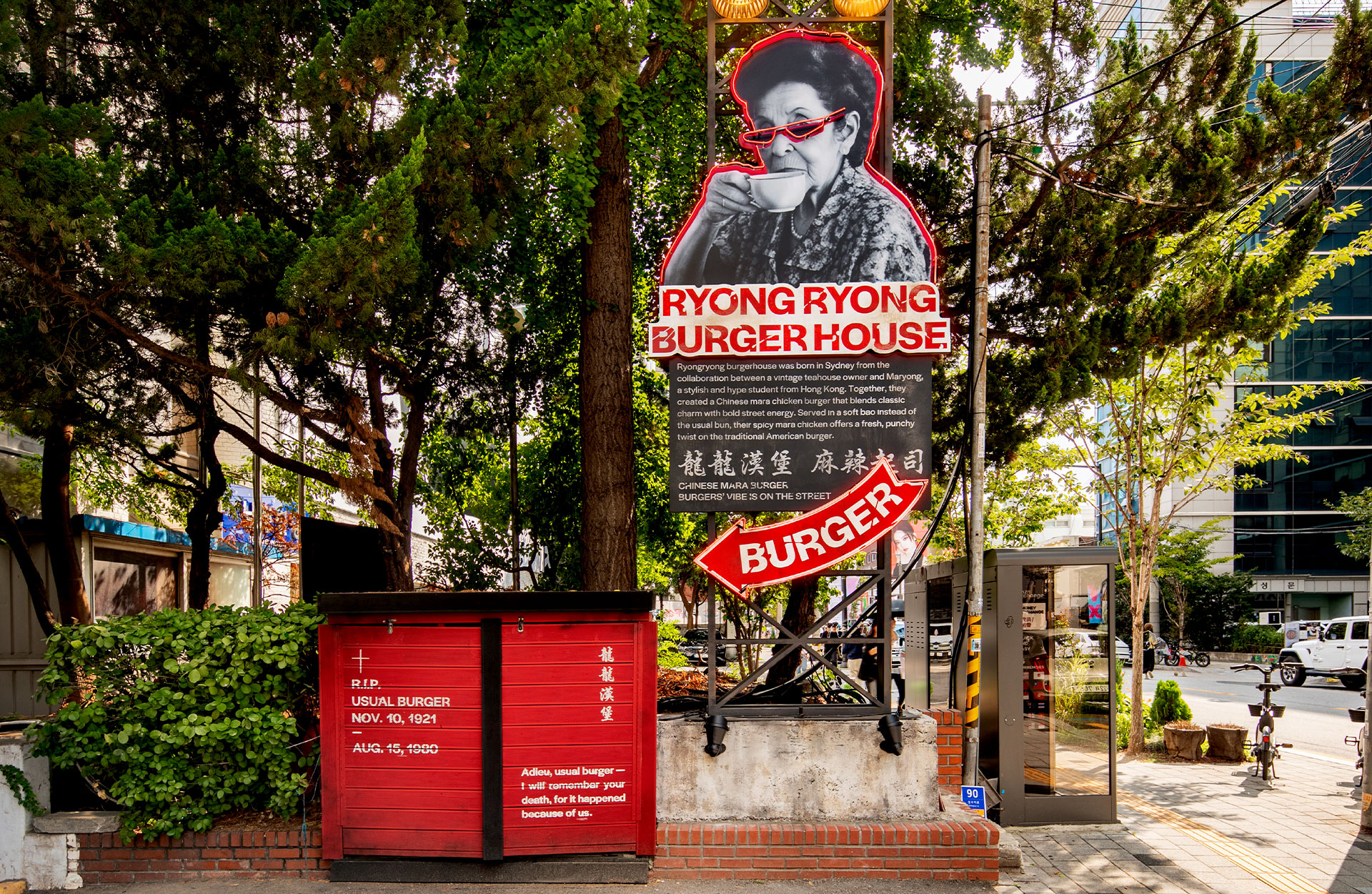
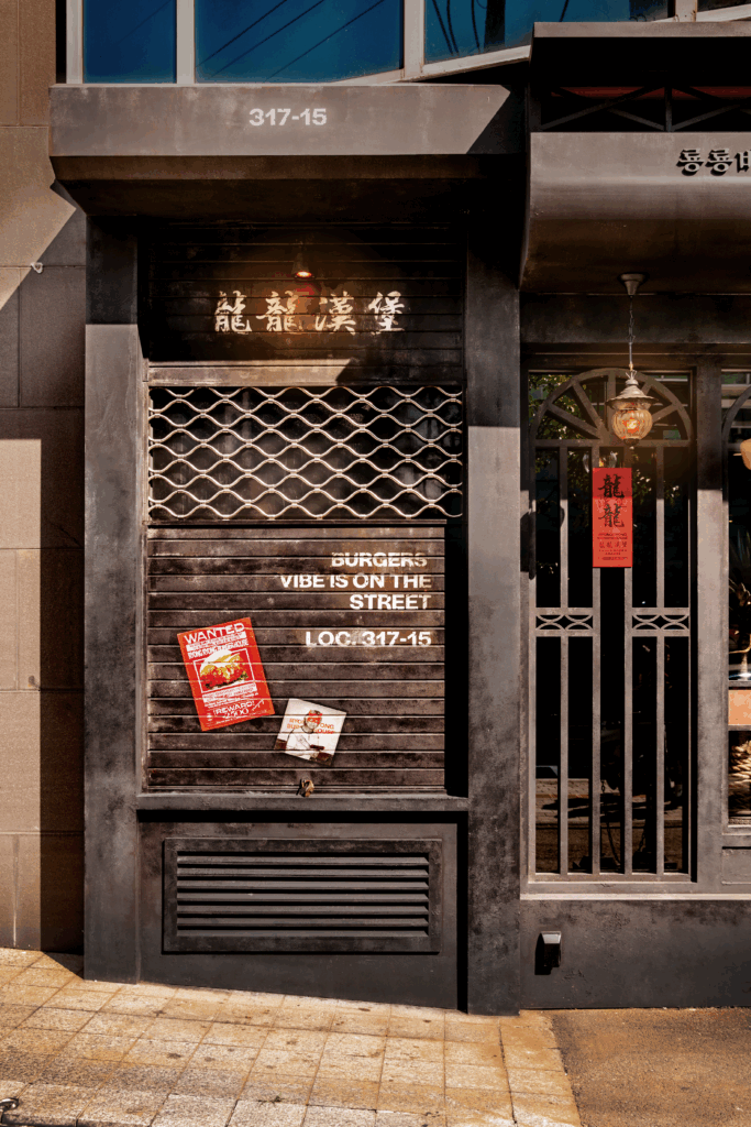
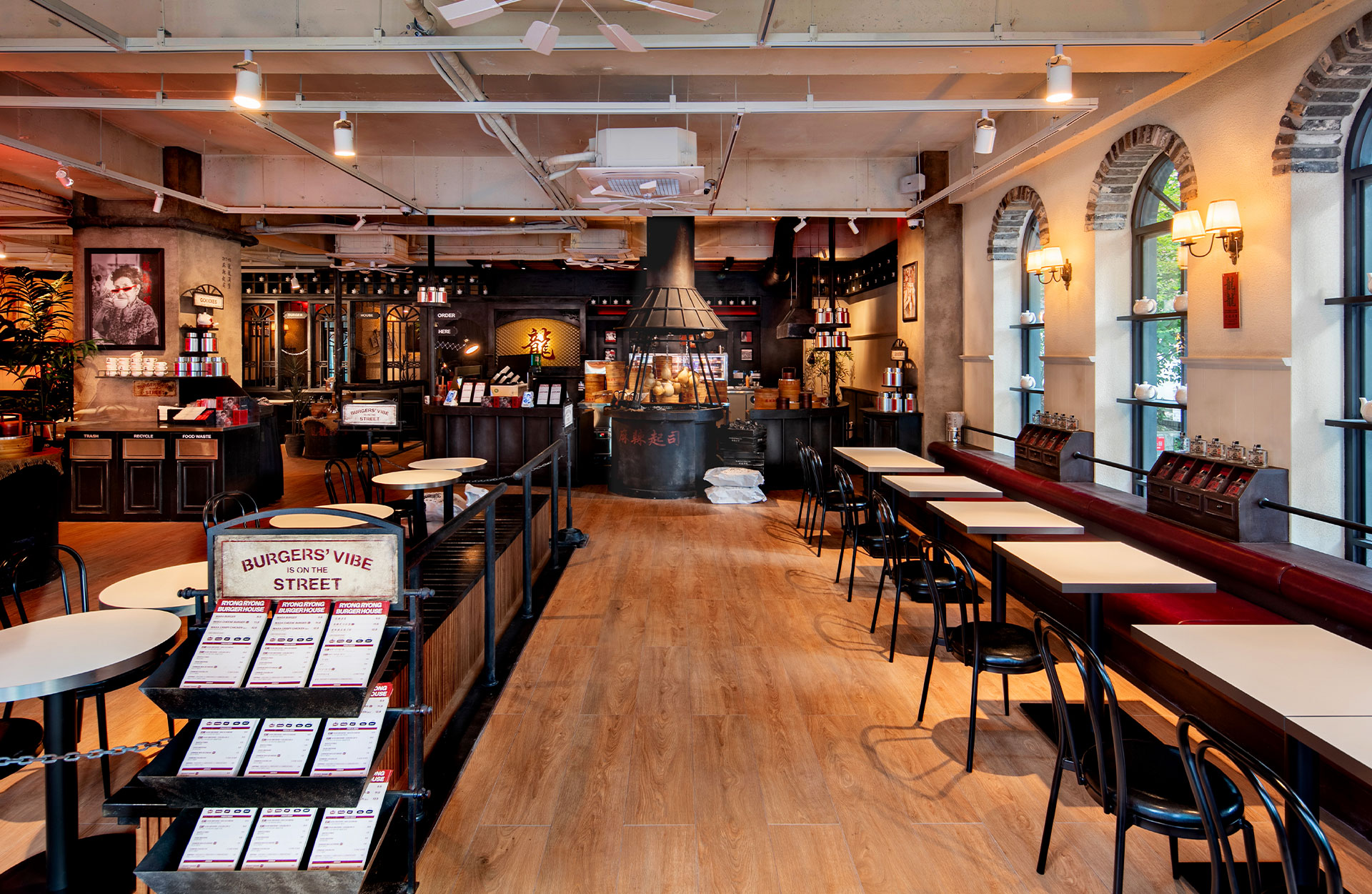
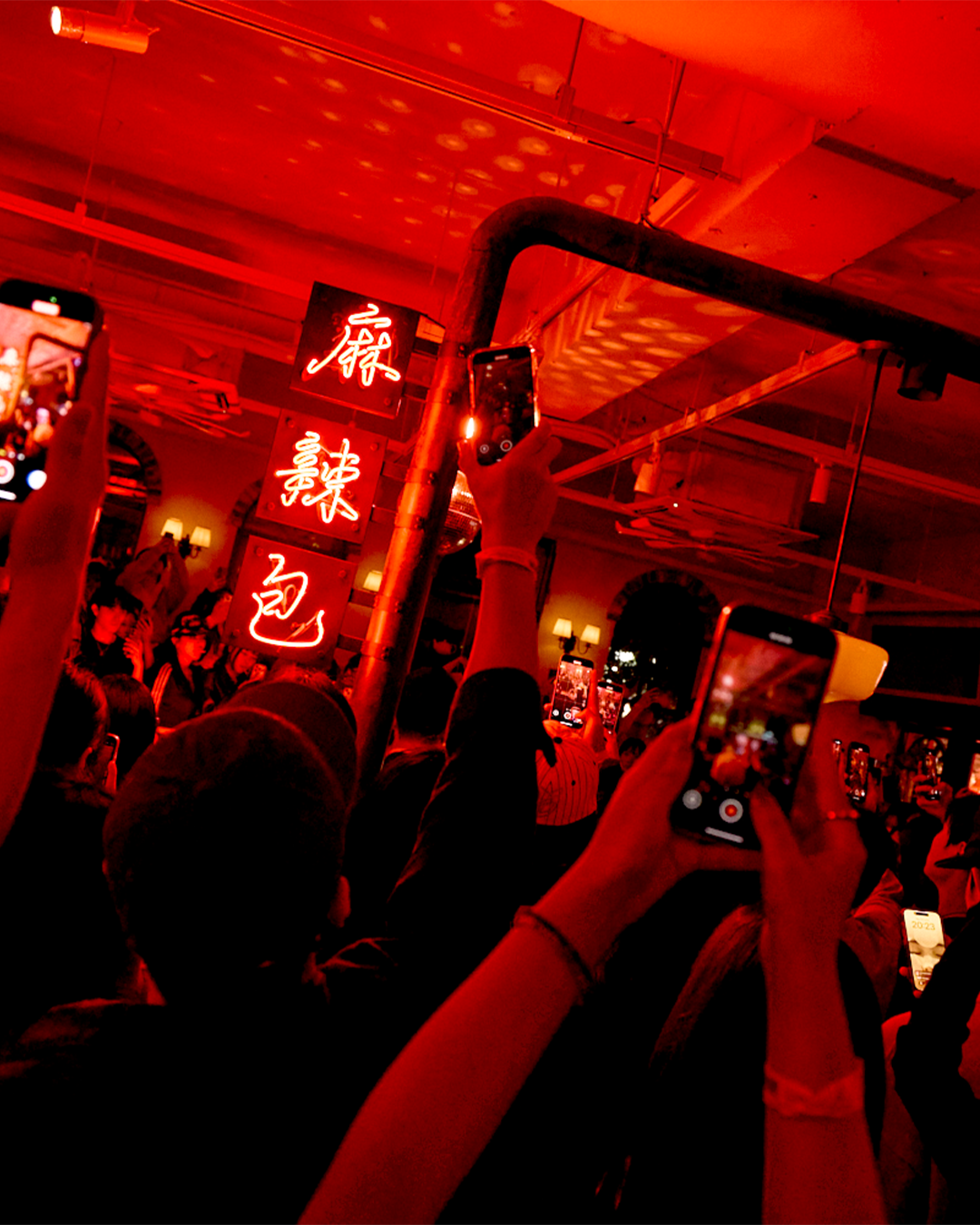
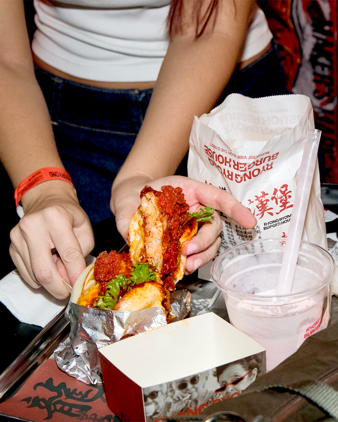
버거는 본래 거리의 음식이었다.
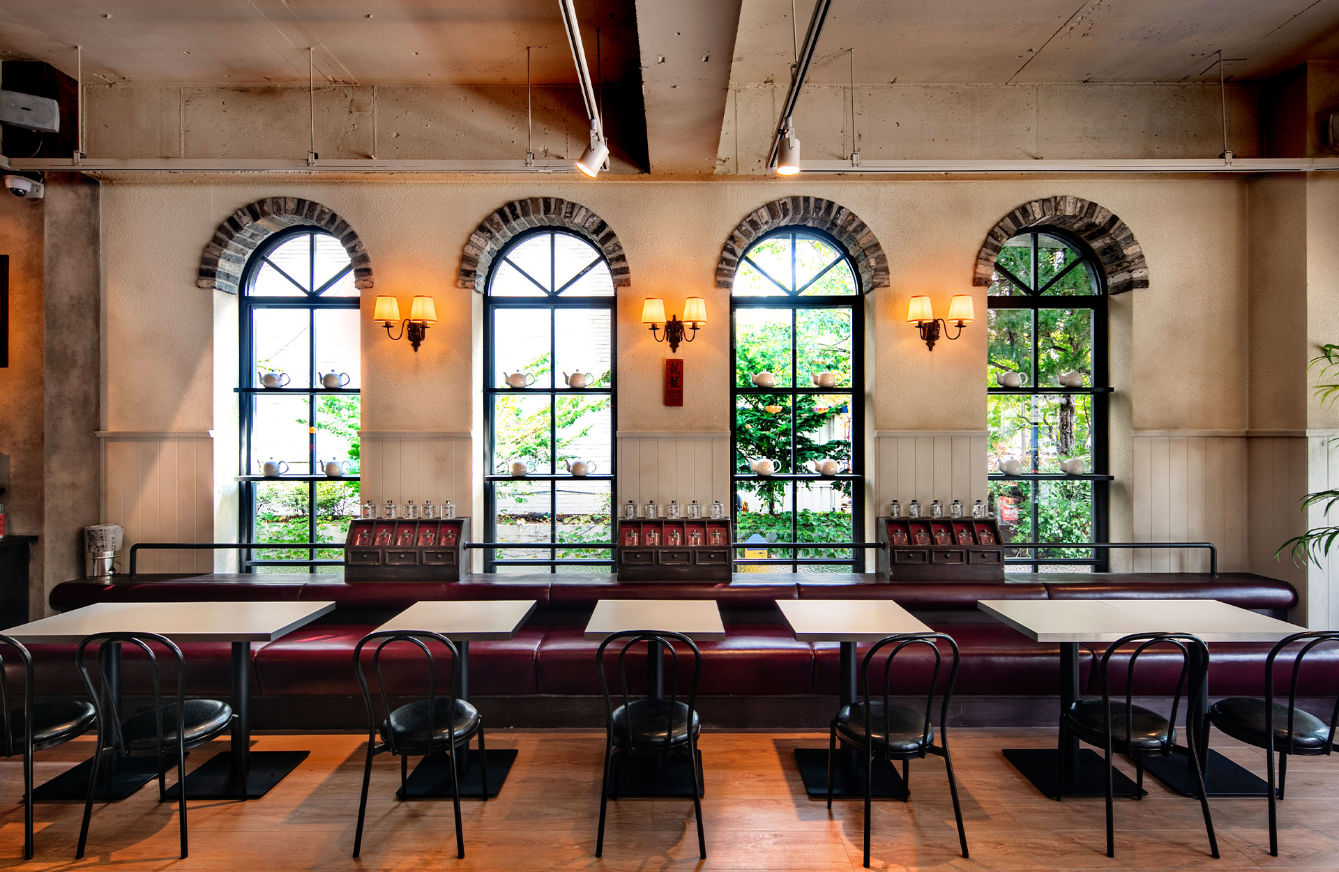
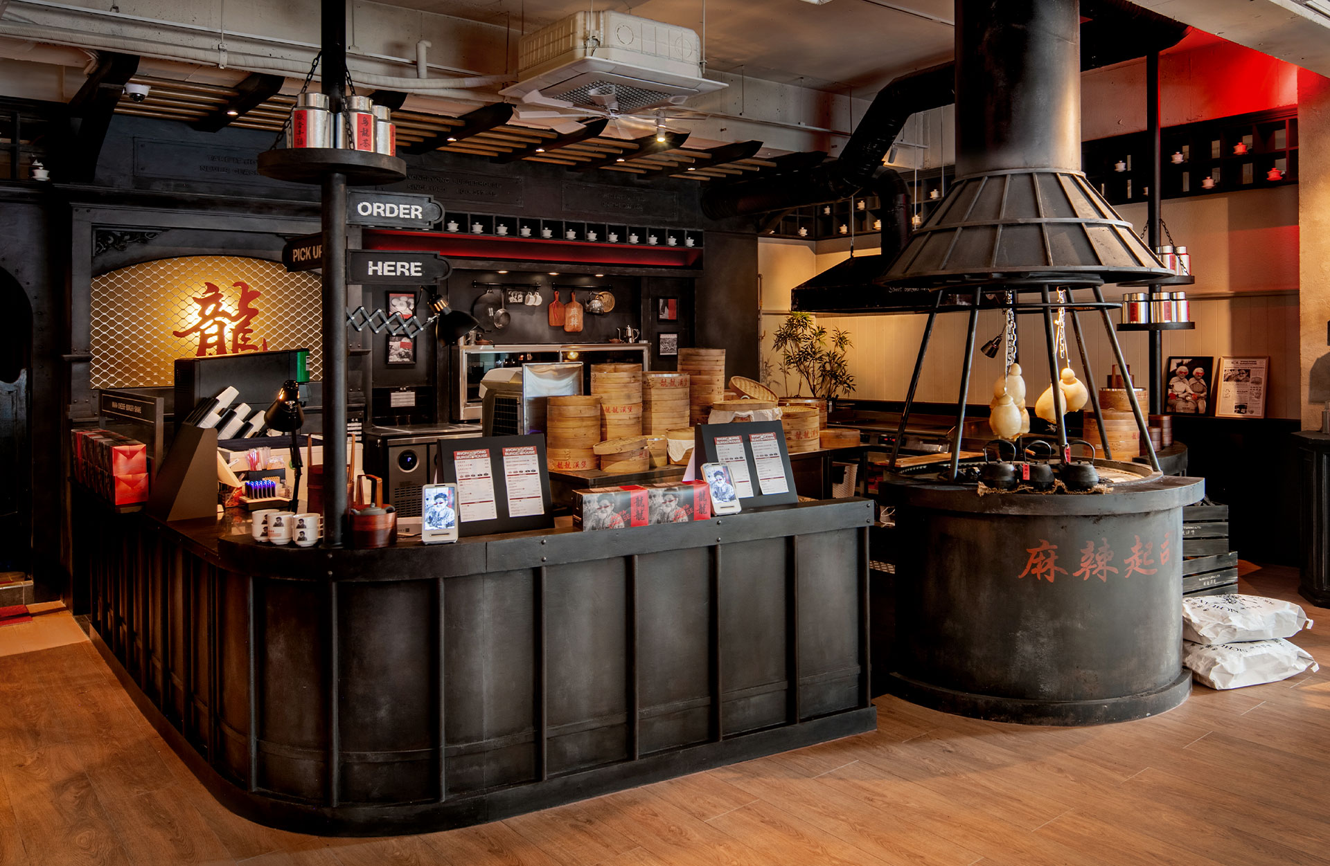
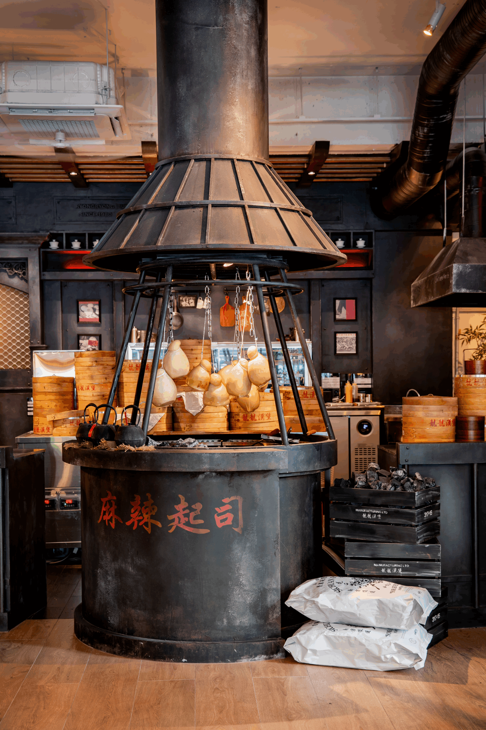
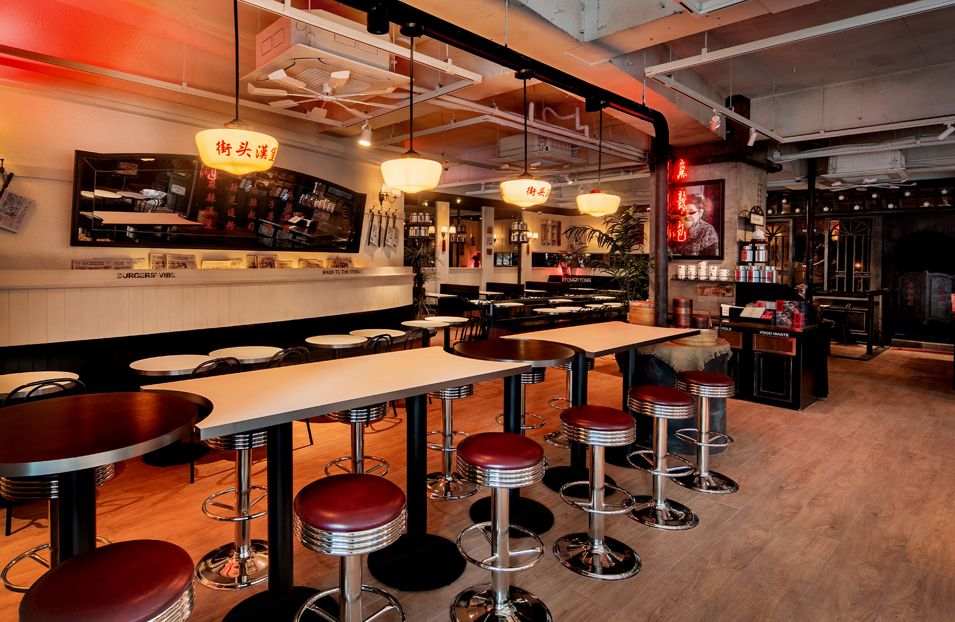
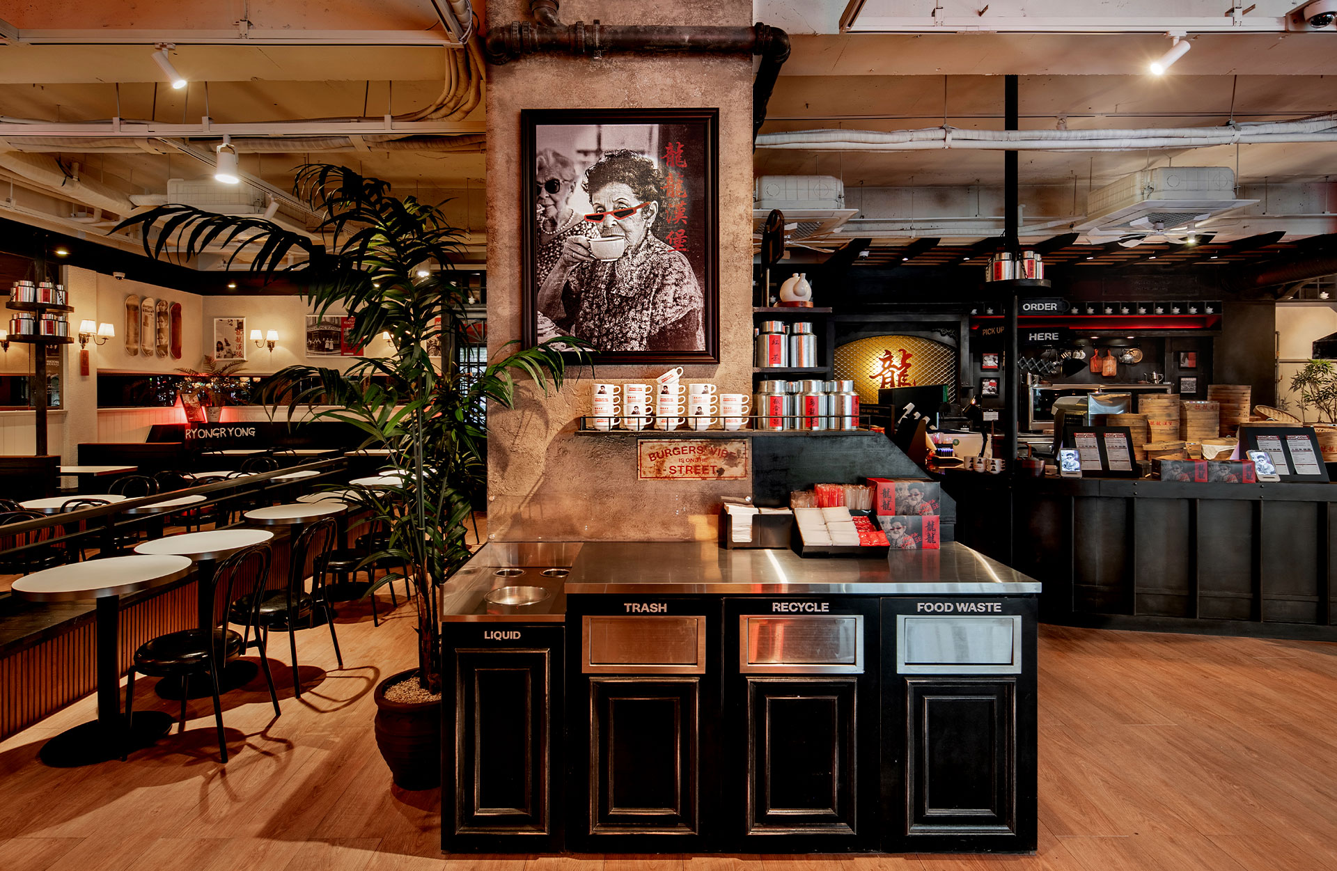
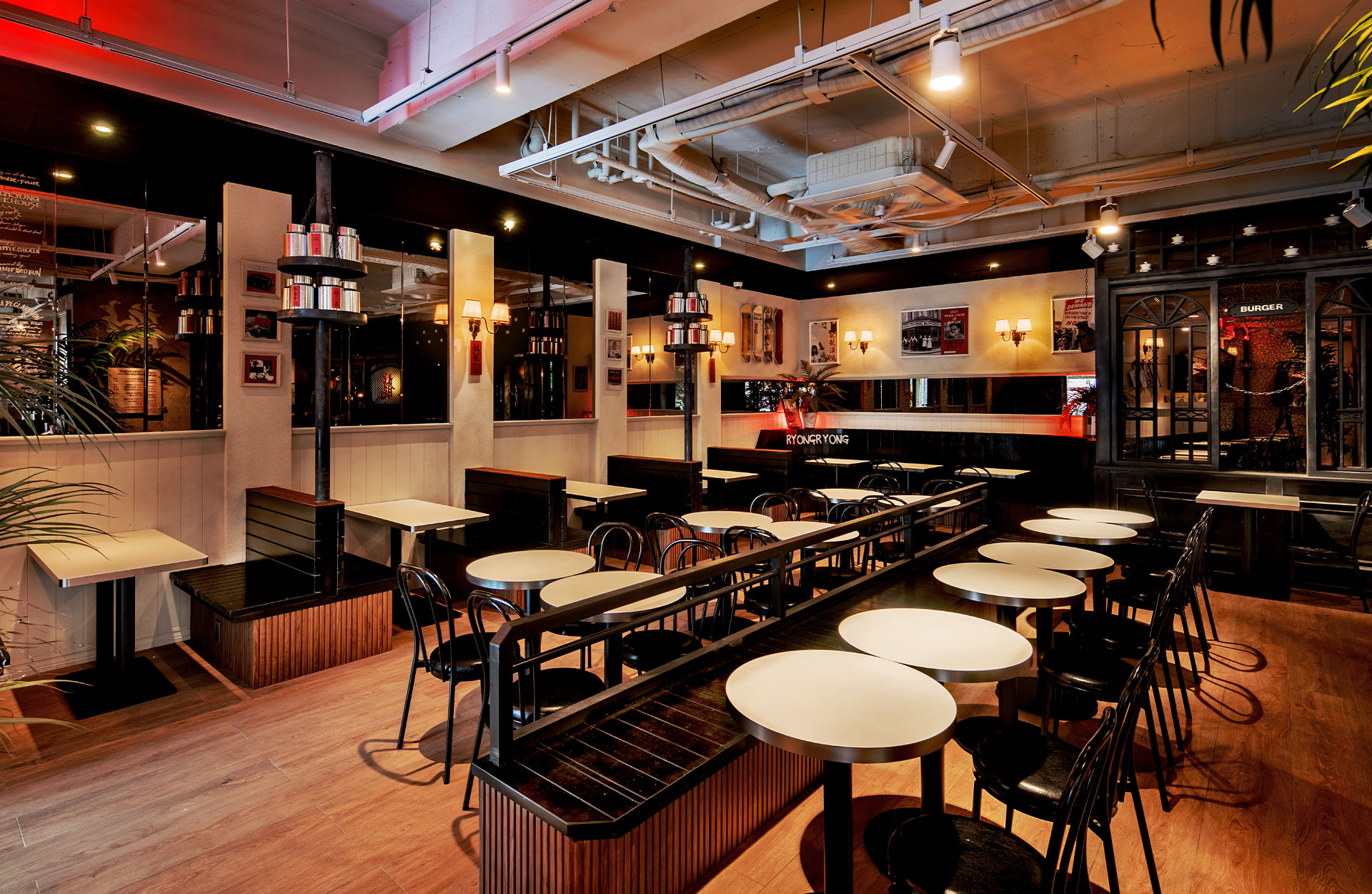
손으로 쥐고, 한입에 베어 물며, 자유를 느끼는 가장 단순한 방식의 식사. 하지만 시간이 지나며 버거는 패턴화된 브랜드와 메뉴 속에서 점점 재미와 정체성을 잃어갔다. 우리는 그 본질을 되찾고자 했다. 그래서 룡룡버거하우스는 ‘격식’과 ‘자유’, ‘티하우스’와 ‘스트리트’라는 서로 다른 세계를 충돌시켰다. 영국식 티하우스의 차가운 질서 위에 홍콩 거리의 뜨거운 혼돈을 얹어, 전혀 새로운 장르 — 차이니즈 버거하우스를 만들어냈다.
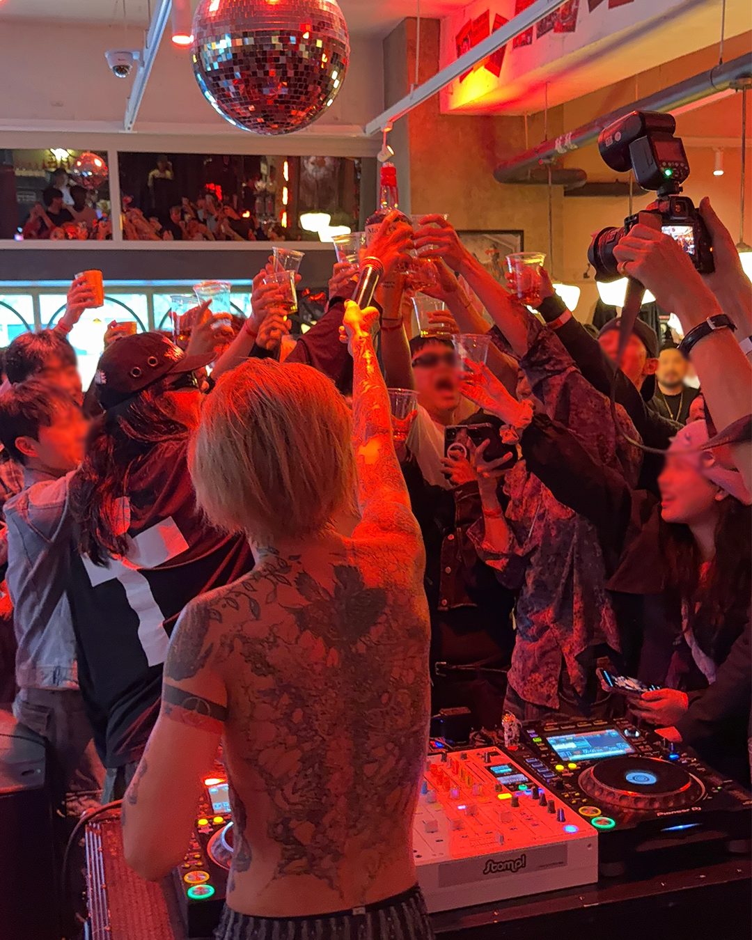
이곳에서 버거는 단순한 음식이 아니라, 예술과 반항, 그리고 자유의 태도를 담은 하나의 문화로 존재한다. 우리는 버거를 통해 표현하고, 저항하며, 즐긴다.